
We want to deploy our faith-based app, PandoApp, onto every prison tablet in the country so that every inmate feeling hopeless and lonely in their cell can turn on a worship song or a sermon and feel the presence of the Lord.
We want to launch more churches inside of prison walls so that inmates can shake the hand of a volunteer who shows up every week to tell them how loved and known they are and feel true community.
We want to continue to launch seminary programs so that men and women can rise up and take their place as ambassadors for the Kingdom.
We will stop at nothing, ensuring every inmate in the U.S. has direct and personal access to the gospel and spiritual resources to not only help them grow their faith, but heal trauma and wounds, break addictions and cycles, and allow them to step into their calling as sons and daughters of the Most High.
The Hero has a strong sense of right and wrong, looks to make a difference and seeks to overcome injustices and problems. They have a core desire for mastery and inspiring others to push themselves. Hero brands portray success through hard work and effort and meet challenges head-on. They are proud that their work sets them apart and see what they do as important and empowering.The Hero encourages their audience to rise to the challenge of meeting their ambitions. Their ability to inspire the possibility to achieve allows them to deeply connect with their audience and paint a picture of the gratification that comes with it.They work hard in order to have the skills they deem required and take pride that their work sets them apart from the rest.
A brand’s character is made up of many different characteristics or attributes, the sum of which is far more powerful than any single trait. By attaching human characteristics to a brand name, we can humanize a corporation and create an emotional connection with consumers.
To conquer the seemingly impossible and inspire others to do the same.
To improve the world
Motivate and encourage
Innovation, bravery, growth, and inspiration
Prove their worth through courage and determination
Customers of The Hero archetype put their trust in brands that promote bravery and justice, especially those that inspire the customer that they too can be a hero. Being driven by their desire to make a difference and conquer the impossible, they shy away from anything with incompetence or cowardice. This audience tends to seek solutions that are both daring and trustworthy or those who want something different than the rest of the crowd. Innovation is not only welcomed, but encouraged.
Inspired
Empowered
Kingdom Impact
Uncommon Excellence
To make a notable difference
To put their trust into something bigger than themselves
Inviting
Kingdom-Minded
Inspiring
Life-Change
Passionate
Innovation
Your voice is your point of view. It is both what you say and how you say it. It has a feeling and an attitude. A sound and a cadence. It is how you present yourself in a verbal manner. It takes into account the words as much as the delivery. When you have a singular voice, all communication sounds consistent. There is consumer recognition, believability and trust.
It is welcoming and inspiring.
Meaningful and compelling.
It breaks the mold of the mundane.
It appreciates modernization.
It delivers excellence.
And above all, it compels individuals to step out in faith for the sake of a greater freedom.
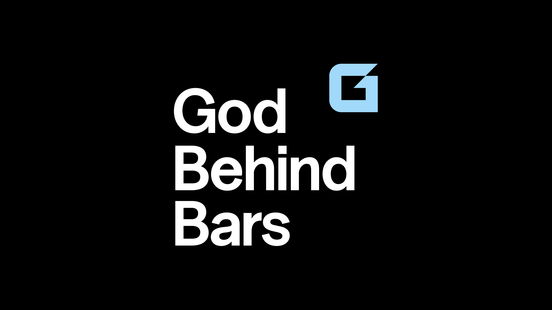
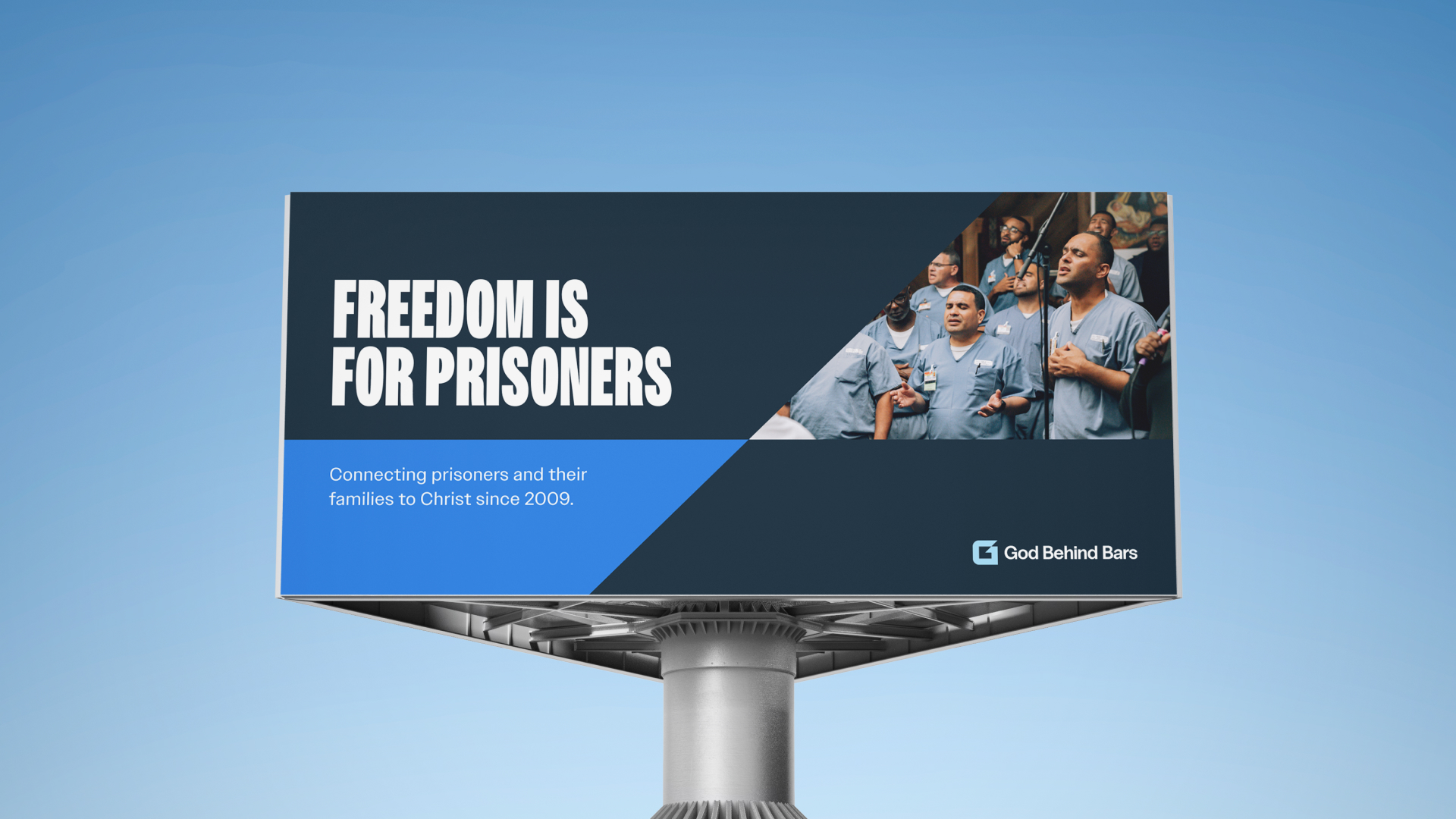
One of our most recognizable elements of brand identity. Consistently applied placements, clearspace, and color treatments ensure our logo remains iconic in any context.

Horizontal Lockup is considered the default and primary choice for most use cases.

Otherwise known as the brand symbol. It lives on it's own or alongside the wordmark in it's various forms.
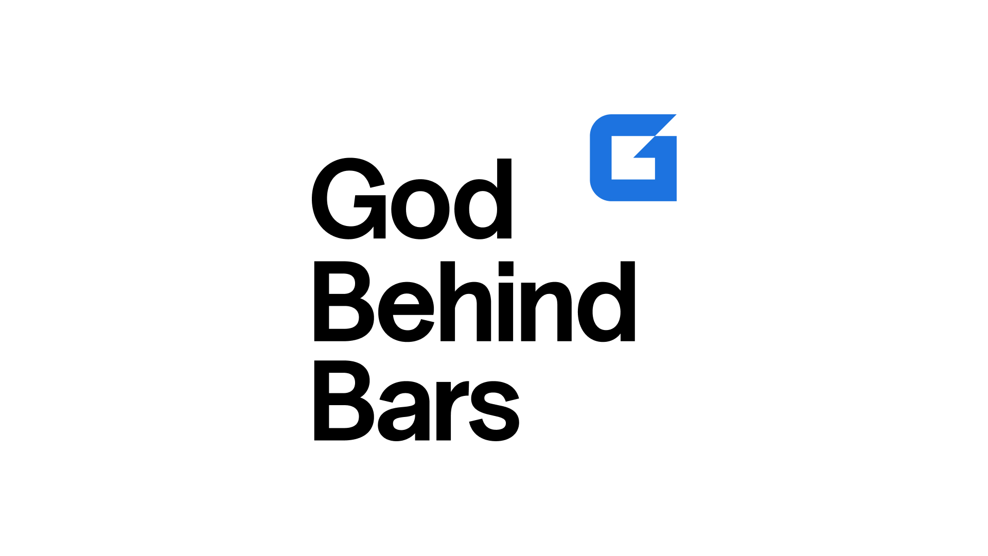
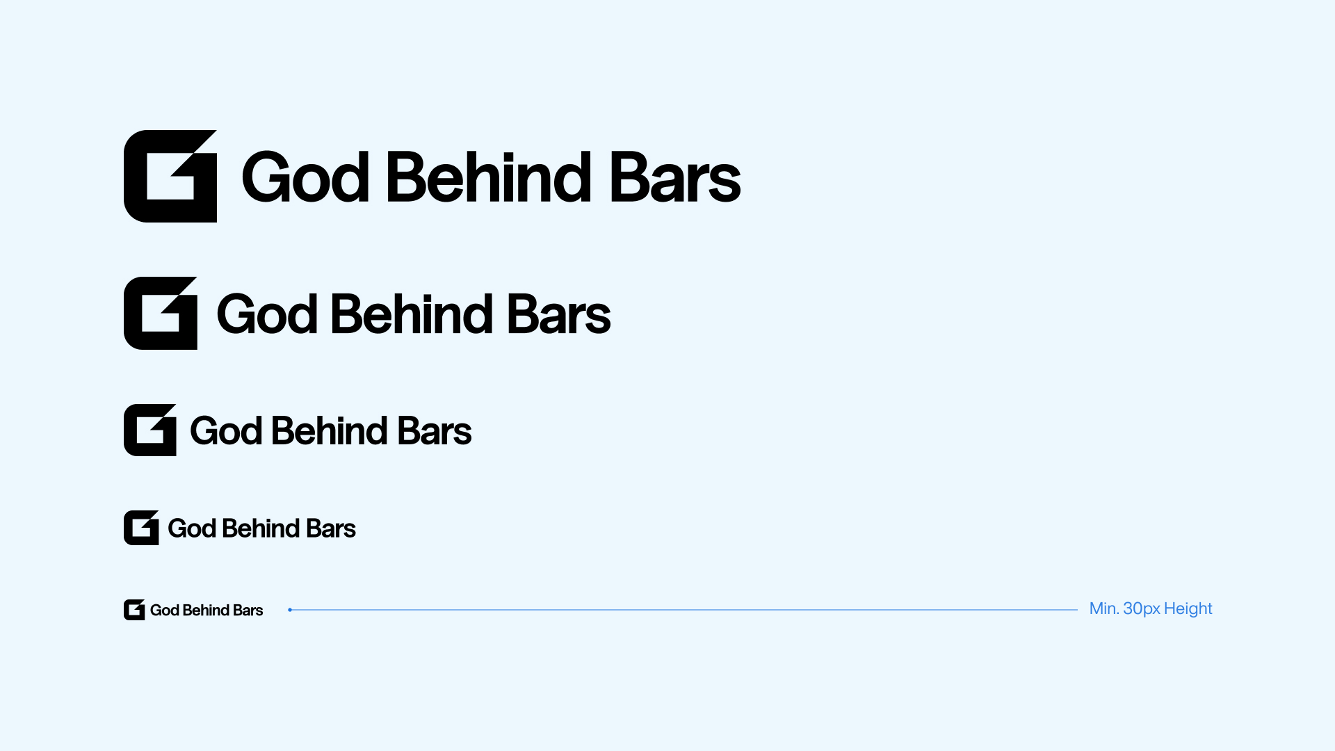
If space is limited then use the secondary stacked logo. Also great for editorial uses.
For limited room or to have a mark for casual uses.
It is important that the appearance of the logo remains consistent. It should not be reinterpreted, modified or embellished. No attempt should be made to alter the logo in any way. Below are some mistakes to avoid.

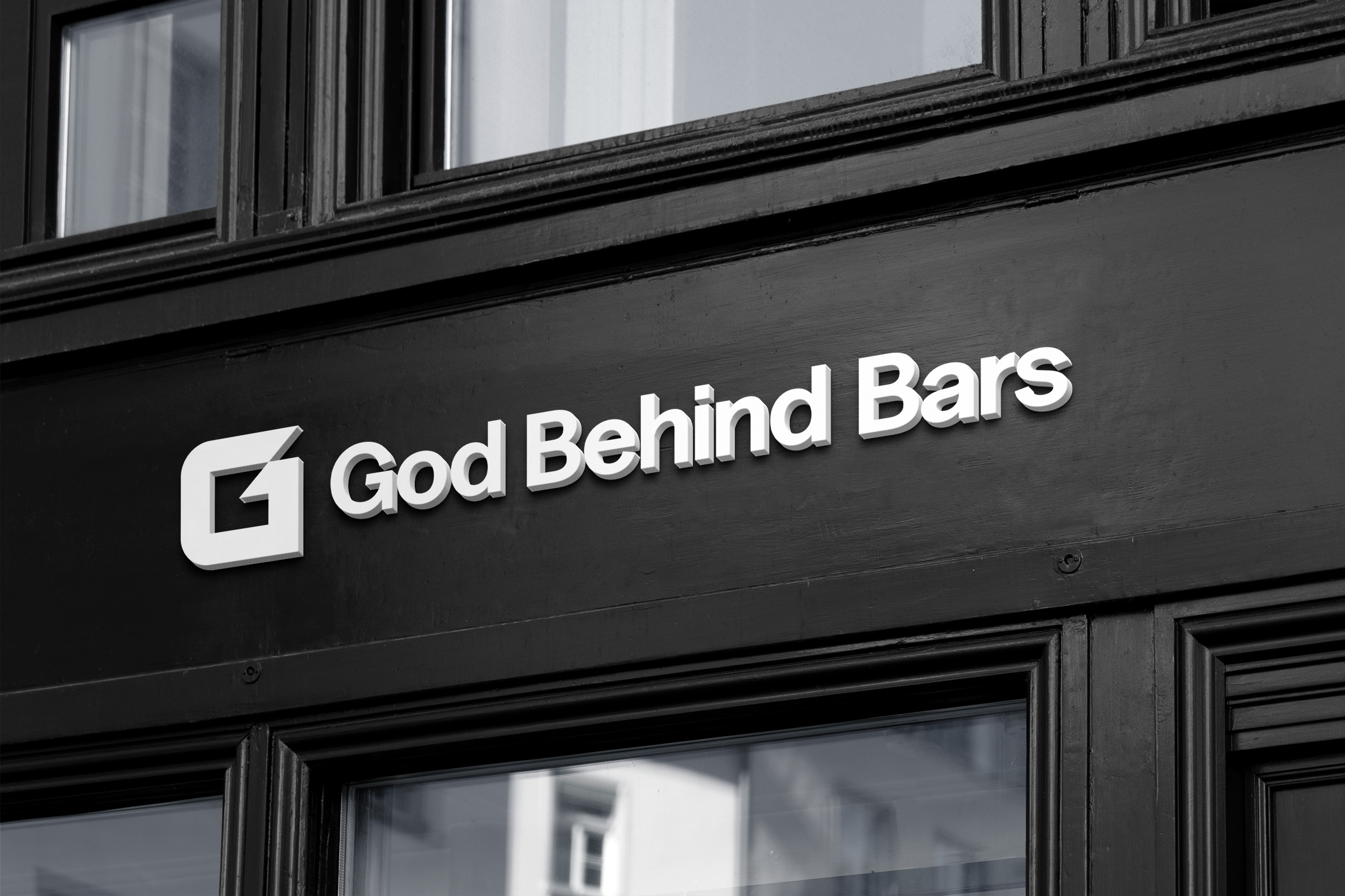
When applying the logo to a facade, keep in mind the surface to which the logo is being applied to. It is advised to use a white logo with dark edges for the best visibility.
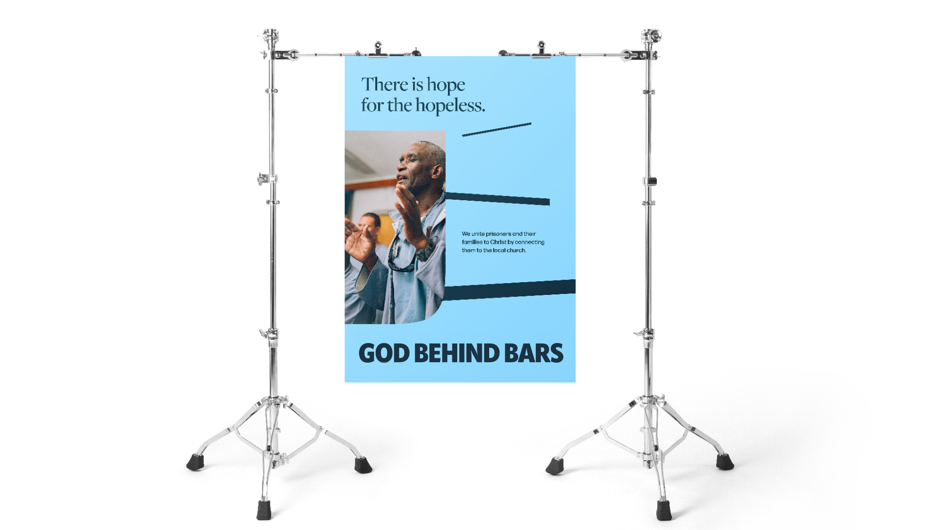
The main font of our brand is the Owners family of fonts. Straight-forward with a polished simplicity, our typography gives all the key information but never talks over the main content.
The first encounter with God, the moment that freedom enters the jail cell, when father and daughter are reunited. These are the connections we live for.
Using repetition of the Logo Mark and creative cropping, we can create dynamic compositions to make exciting layouts.


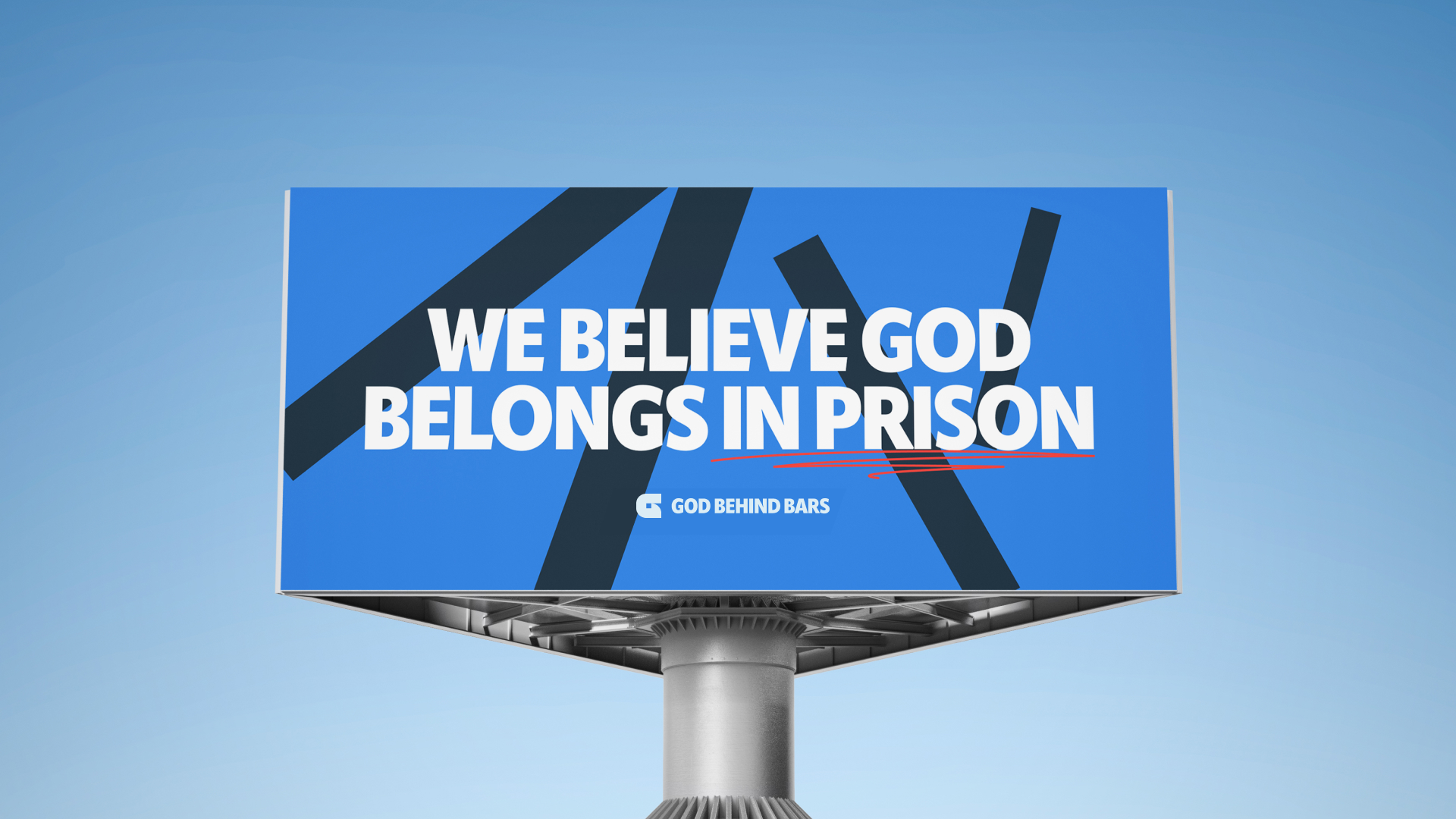
Visualizing the duality of freedom behind bars.


.svg)
.svg)
.svg)